Print Design

Chimera Volume 3
- Date
- 2006
- Specs
- 7 × 7 inches 188 pages 4 color process
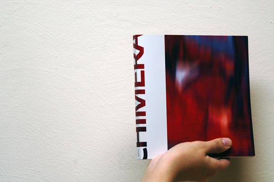
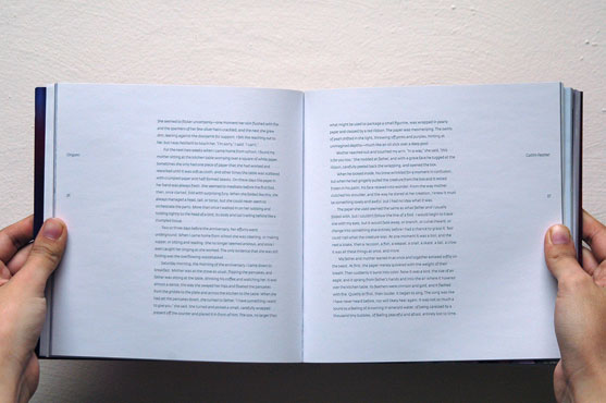
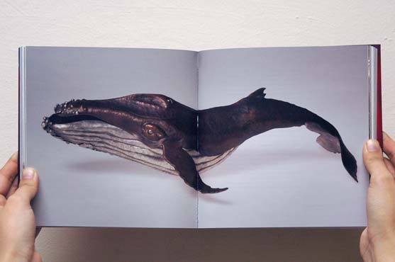
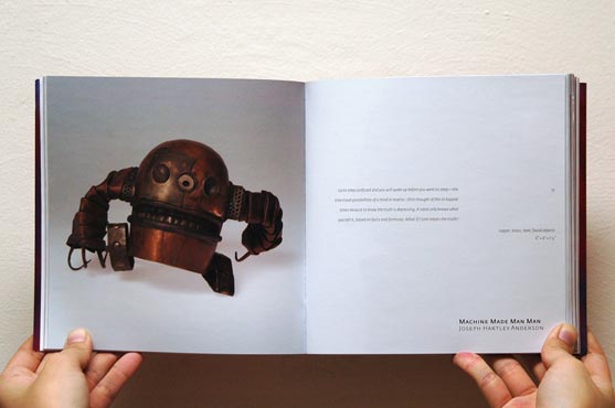
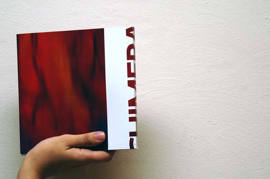
Chimera is a compendium of literature and art jointly produced by the English and Art departments at Edinboro University of Pennsylvania every year. The book features prose, poetry, two–dimensional and three–dimensional artwork, a variety of content that presents unique layout challenges. I designed Volume 3 in collaboration with Josh Carmichael and Jilliann Chaklos and under the art direction of Amanda McLaughlin. The UCDA selected it among the “Best of Student–Published work in Any Category” for 2006.
Alumni Association Postcards
- Date
- 2008
- Specs
- 5 × 7 inches 4 color process
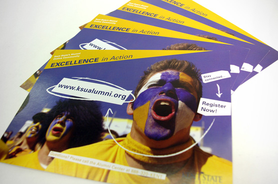
Postcard for the Kent State Alumni Association advertising the newly launched online community. Completed at Glyphix.
Kaled Sans Typeface
- Date
- 2006
- Specs
- OpenType
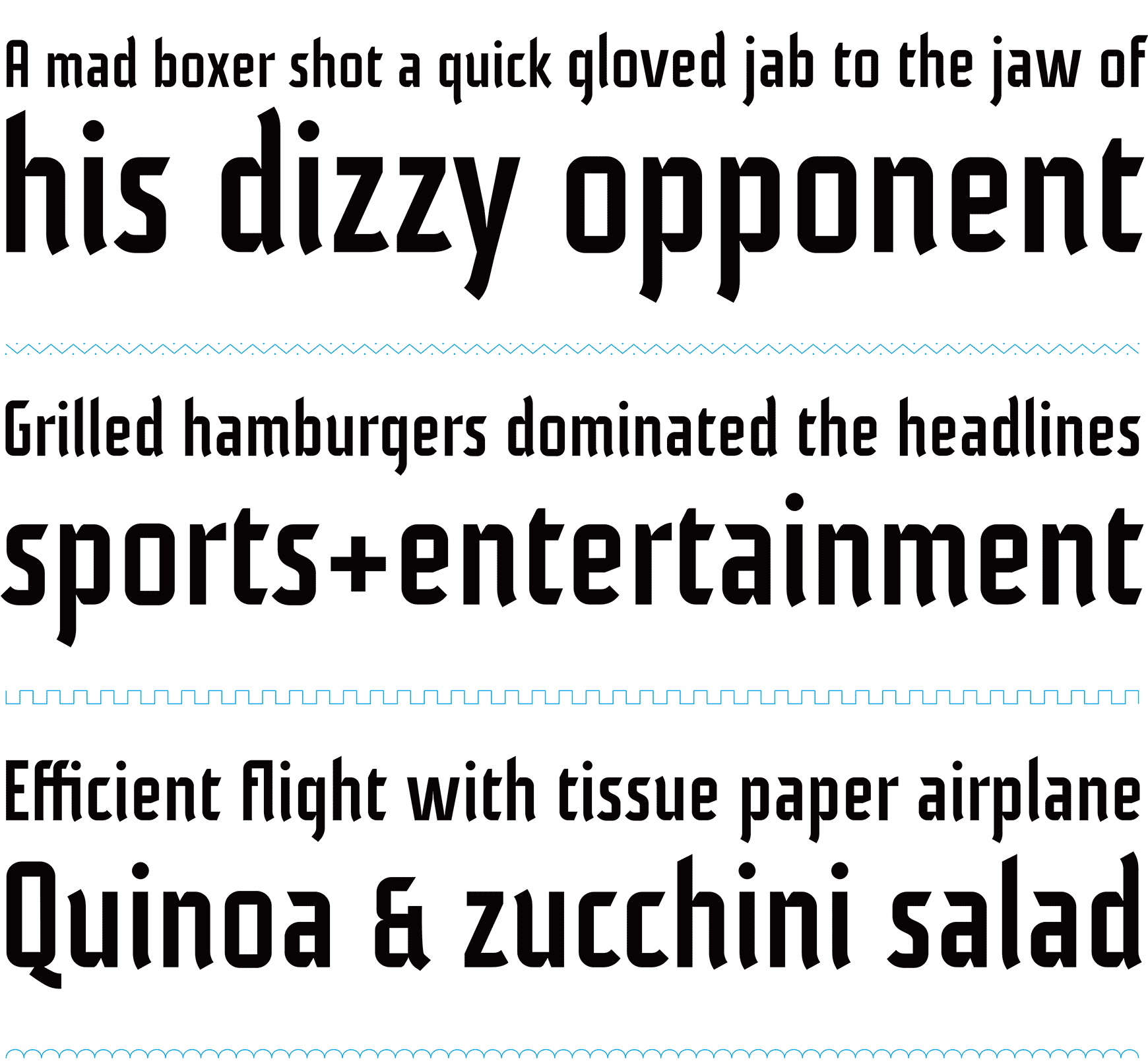
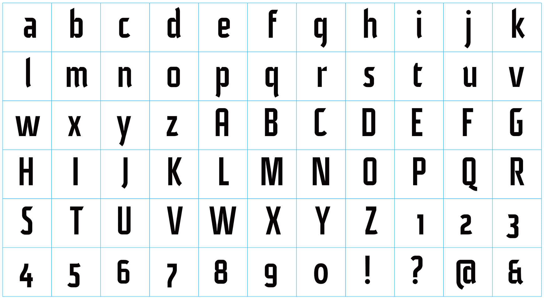
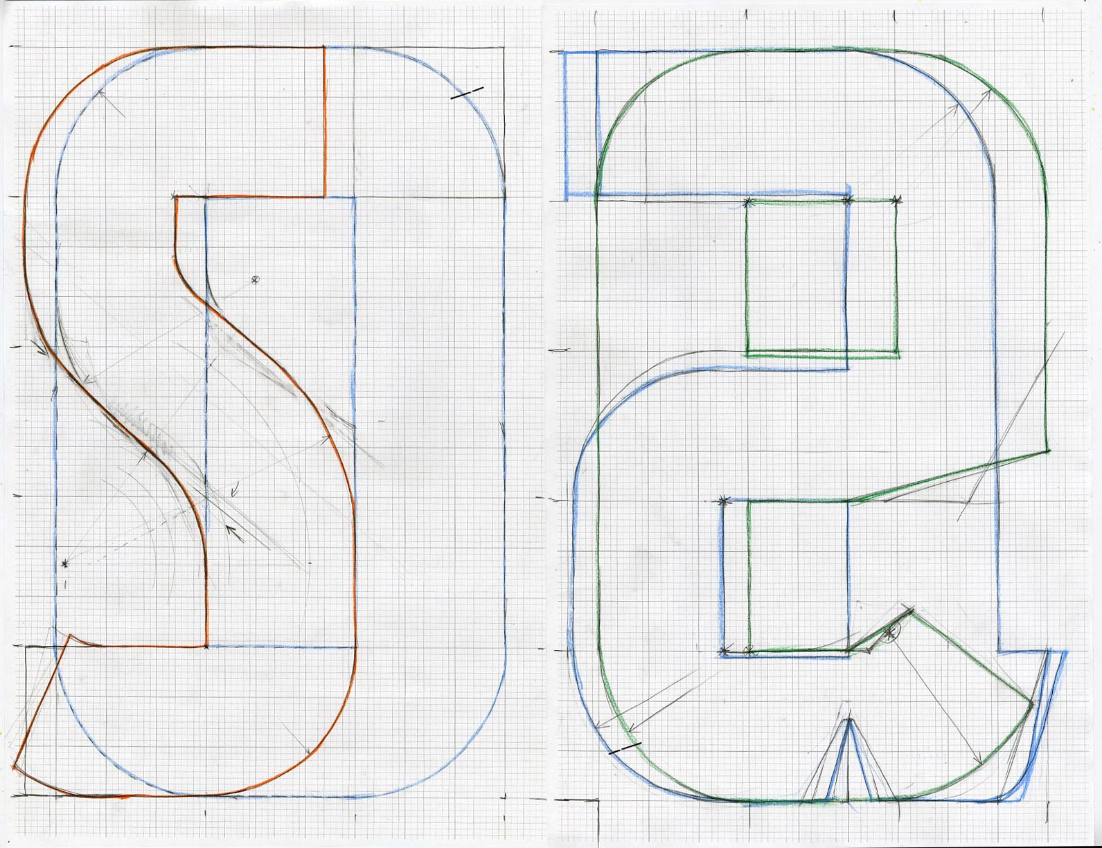
Kaled Sans is a sturdy OpenType display face with a touch of calligraphic hand and subtle reference to the blackletter form. It features old-style-numerals and discretionary ligatures. Stylistically, it complements the genre defined by Gunnlaugur Briem’s Akademi and Georg Trump’s City.
Shoptalk Volume 3
- Date
- 2006
- Specs
- 7 × 8½ inches 72 pages single spot color interior / 2 spot colors cover
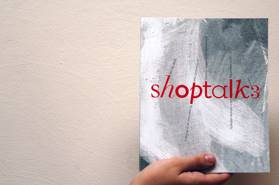
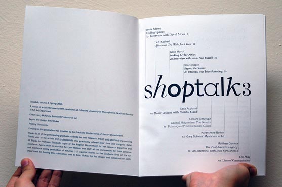
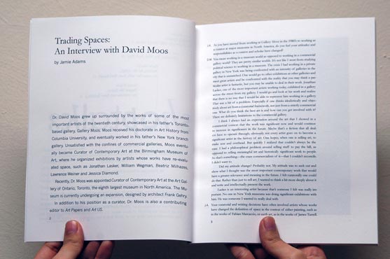
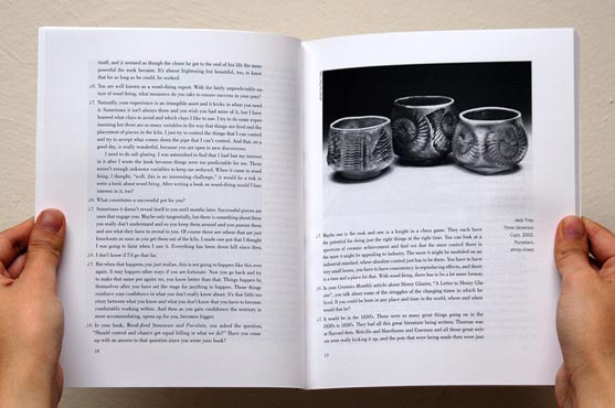
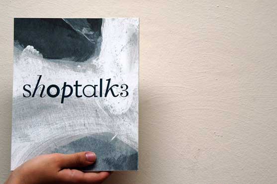
Shoptalk is a publication of art interviews conducted by the MFA candidates at Edinboro University, edited by Prof. Terry McKelvey. The book features interviews between nine students and nine art professionals. It is set in nine different typefaces (this was before the publication of Bierut’s 79 Short Essays on Design!).
Student Exhibit Poster
- Date
- 2005
- Specs
- 3 × 4 feet single spot color
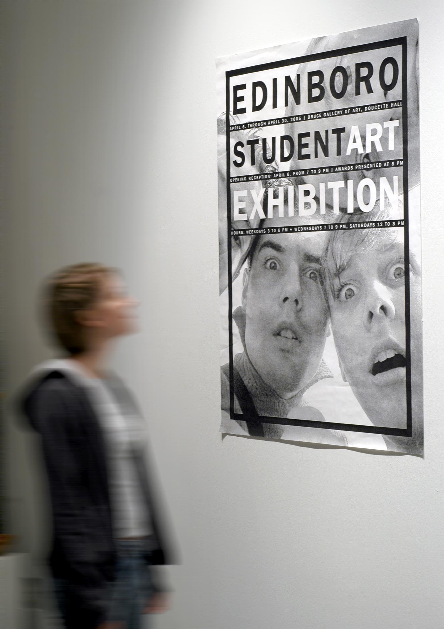
A poster announcing the annual exhibition of student work at the Bruce Gallery of Edinboro University. The student exhibit, an art department tradition, typically closes the exhibition year at the gallery.